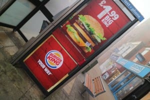
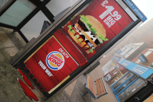
For my first image I chose this Burger King advertisement on the outside of a phone box. I overlayed the meat of the burger with the pattern of a cow to create a stronger mental connection with the animal and the food to give a similar impression to my Kruger inspired piece during development. By adding the word “death” above the slogan I was able to re-contextualise the meaning of the image in a similar way to the work of Barbara Kruger to which the image is completely transformed through the use of language and text. I played with the idea of adding this across the image over a red banner and white writing as I had done prior but felt it looked even better embedded into the actual poster.
I added a bloody effect just to create a stronger image and add some shock value like groups such as PETA and WWF I had looked at had done to really push their campaign.
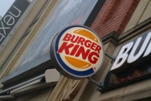
For my second image I decided to stick with the fast food concept and worked with a Burger King logo on the side of the Waterside Shopping Centre that caught my eye with it’s bright commercial reds and yellows standing out on the side of an otherwise plain building. By simply changing a word the image could be changed completely and would fit in well with the examples that I researched. Yet again I added a bloody effect to give it more of a dramatic impact. I originally thought about making the photograph itself black and white with red as the sole colour, somewhat reminiscent of Shepard Fairey’s artwork however I wanted to create an overall aesthetic for my images to make them appear to exist in the real world and not too abstract.
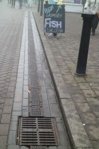
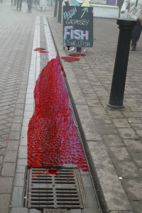
My final image was very much inspired by the exotic animals campaign by WWF in which a woman wheels her suitcase through an airport leaving a bloody trail behind her. To do this I layered a blood looking effect over the image to give the impression it is coming from the marketplace the sign is placed. I feel this concept worked very well and I’d hope to recreate it with a little more knowledge of the use of Photoshop or practical devices to give it a more realistic effect. I feel this relies very much on the viewer reading into the image rather than using a graphic image of the animal and could therefore appeal to a much larger audience.
